Ranter
Join devRant
Do all the things like
++ or -- rants, post your own rants, comment on others' rants and build your customized dev avatar
Sign Up
Pipeless API

From the creators of devRant, Pipeless lets you power real-time personalized recommendations and activity feeds using a simple API
Learn More
Comments
-
 coookie26009y@Letmecode Thanks a lot for pointing out the mistakes and damn supporting screens is a bit of pain in the ass.
Managed to fix the issues though, I hope you like it now 😃 -
 drrn4019yI like it! However there is a spelling error:
* Minimalist
It would maybe make more sense though to say either:
"I like minimal design" or "I like minimalistic design"
Keep it up though, minimal is good! -
 coookie26009y@fuzzy My brain just overlooked 😶
Thanks for pointing it out.
Although googling 'minimalistic design' says 'did you mean minimalist design', so I am not sure which one is correct -
 thedev11649y@coookie about your résumé, order entries by putting the latest first. in short, order by date desc 😉
 -
 coookie26009y@pixeltherapy I have absolutely no idea why tf it's not working. The worst part is I don't think I would able to fix it. Which makes me realize why I always stayed away from Frontend 😂😂
 -
Ah! That's the anime-js library. Haven't used it yet, looks awesome.
Yes, the opening anim is a tiny bit long. 2-3 secs would be enough. 4 at most.
On the CV, use the GitHub octocat icon instead of star. Would make it easier to find it quickly after you reference in your intro.
iOS hates it. Not sure why. -
@coookie by rights you shouldn't have to worry about that. Anime.js has the prefixing you need.
On a side note, you're loading 5 fonts from 3 families via Google. It might be the font-loading mucking it up on iOS. You could probably drop Lato entirely.
👍🏻 awesome stuff though 👍🏻 -
I agree about the animation timing but overall it is minimalistic and impressive. Good stuff!
Related Rants

 My friend said an intern designed this UI for an internal site.
No. Just... no
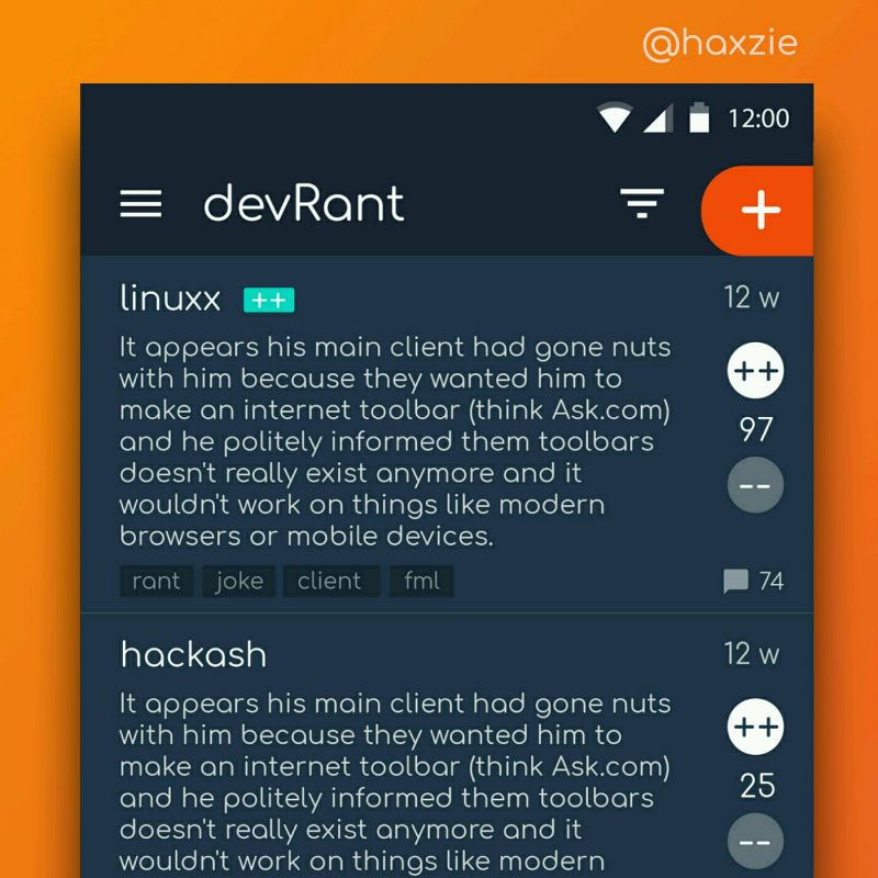
 Been looking around ways to improve devrant's user experience a little, Idk whether you guys like it or not.. ...
!rant
I sure as hell am not a designer, but I do love design. Amidst all this backend, professional work, I found some time to do what I always wanted to try. Make a sleek web page.
And here is the result:
http://iostreamer.me/design/2016/...
I would like to get some honest feedback 😃
undefined
notadesigner
design