Ranter
Join devRant
Do all the things like
++ or -- rants, post your own rants, comment on others' rants and build your customized dev avatar
Sign Up
Pipeless API

From the creators of devRant, Pipeless lets you power real-time personalized recommendations and activity feeds using a simple API
Learn More
Comments
-
 ajit55518197yFor me, the Jammu and Kashmir zone, the conflict / war zone between India and Pakistan, contains the most dense population of devices, much more than technology cities like Bengaluru / Chennai / Hyderabad / Delhi / Pune etc :)
 -
@Codex404 I'm not from NA, but it seems like it covers most big cities from south parts of Canada; including Edmonton and Calgary, that are a bit up higher. If you follow 2 "biggest" roads visible on Google Maps then you will notice that this map with IP connections is linked to them. I imagine that north does not have that dense population nor is it easy to get connection.
-
 Sabro3067y@ScriptCoded Pine trees, mountains and reindeer don't connect to the Internet all that often (smartarse comment I know, yet it is true).
Similar case in Canada, no doubt. -
@Sabro Actually, our moose keep up a pretty active online life. But yes, don't be ridiculous - pine trees aren't online. It's only during the summer months our maple trees *log* on to the web...
-
@ewpratten i know, now I zoom in I do see the border is not where I thought it was while walking to the train :)
-
@ewpratten @Codex404 The WiGLE map shows a lot more northern WiFi networks. I still say this map is missing devices.
-
 Condor315487yMore than anything, I'm surprised to see that the US and Europe are *this* far ahead from the rest of the world technology-wise. I thought it'd be more widespread by now.
 -
 eeee30847yYou can't infer anything without a legend. For all we know the 'highest' color in the colormap is black. Maybe red means 'more than 50 or less than 10'. Who knows? NOBODY!
People: do NOT use meaningless graphs! Boycot them. Graphs need at least one axis (in this case probably a colormap with numbers of a certain unit). -
@faheel what he means is that if it was indeed reversed you are able to manipulate people.
-
 eeee30847y@faheel just search for 'bad colormap' and you'll find some posts and even scientific articles on the subject.
Furthermore, I recommend that you take a look at (or read) data visualisation books, like the ones written by Edward Tufte. There's some beautiful magic in the art of data visualisation. And some great mistakes, unfortunately. -
 Root771677y
Related Rants

 Did you say security?
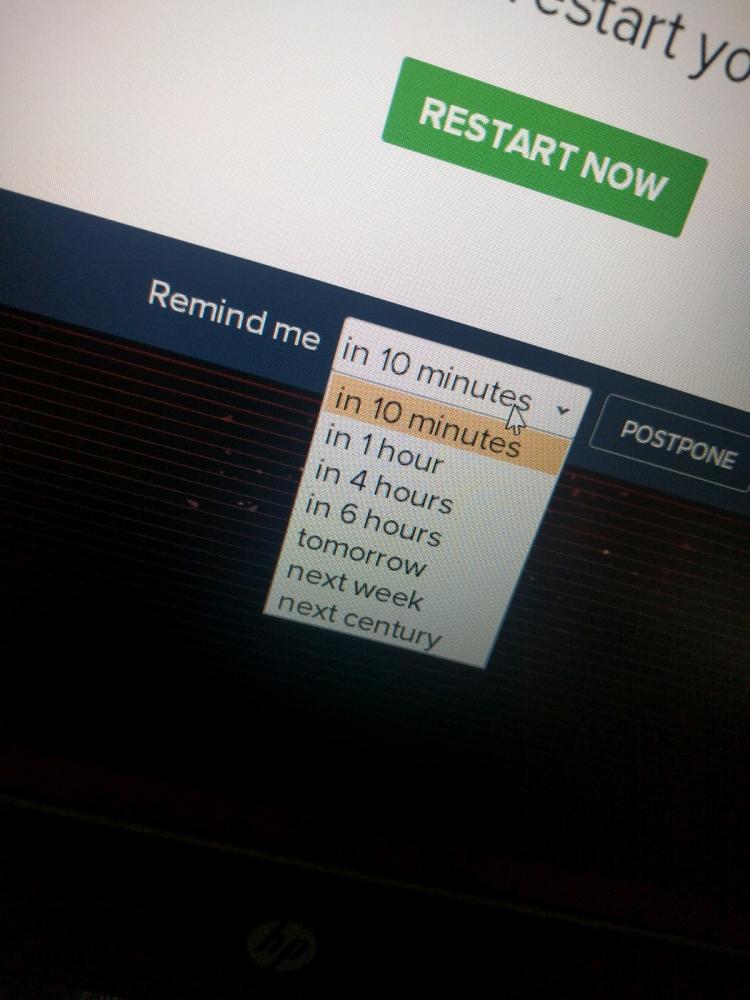
 10 points for next century option.
It is map of various devices connected over public IP to internet. Any interesting insights or comments that you can infer from this map?
question
shodan
security
iot
internet