

Join devRant
Do all the things like
++ or -- rants, post your own rants, comment on others' rants and build your customized dev avatar
Sign Up
Pipeless API

From the creators of devRant, Pipeless lets you power real-time personalized recommendations and activity feeds using a simple API
Learn More


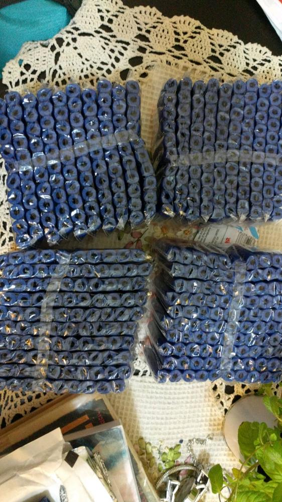 !rant
400 Nerf bullets just arrived... Office is gonna become a war zone...
!rant
400 Nerf bullets just arrived... Office is gonna become a war zone...
 When stack is down 😵
I wonder why new Office icons look like a ripoff from stack exchange....
rant
icons
office
stackexchange