Join devRant
Do all the things like
++ or -- rants, post your own rants, comment on others' rants and build your customized dev avatar
Sign Up
Pipeless API

From the creators of devRant, Pipeless lets you power real-time personalized recommendations and activity feeds using a simple API
Learn More
Related Rants

 Oh but I insist ...
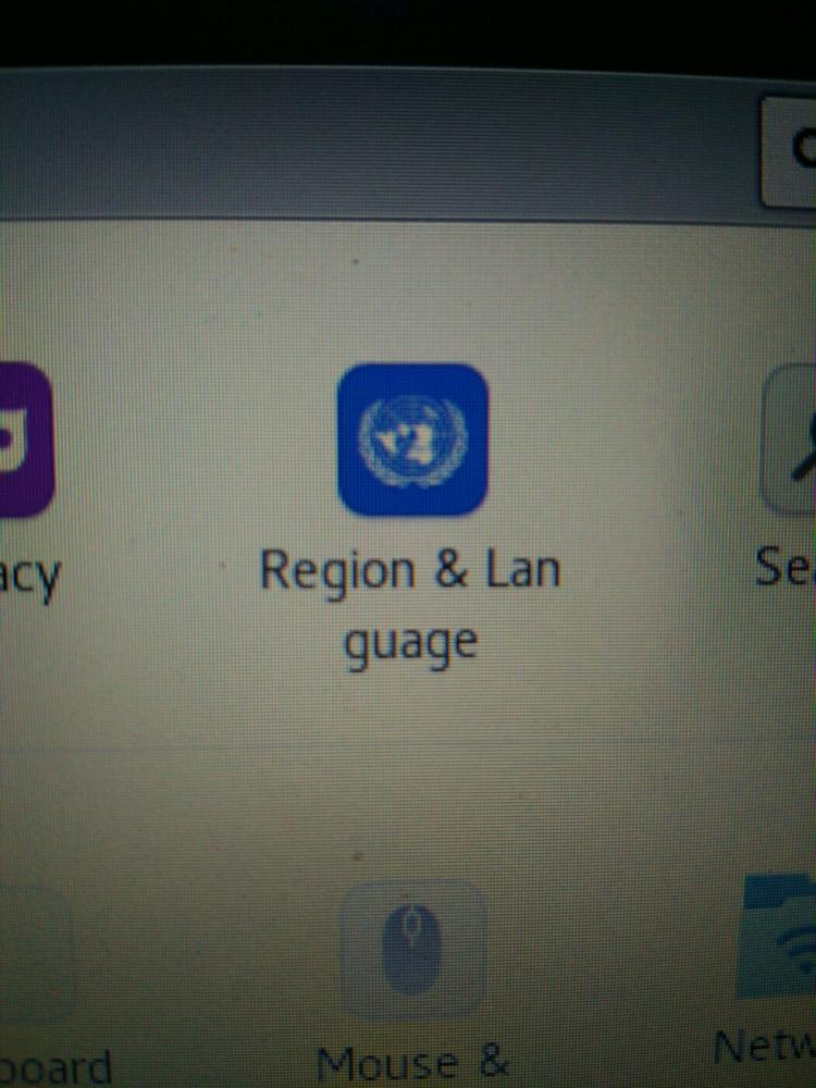
 I was about to Google for "Lan guage". I felt retarded for a minute.
 The real reason that i started using split keyboards
The report button is in the place where reply should be.
I'm a lefty and even I use my phone mostly with right thumb. Also it's very easy to report a comment without noticing (happened to me twice. Reported a perfectly legit and appropriate comment because of awkward report action placement.
IMHO opinion the report action should be placed anywhere else in the post but where it is now.
devrant
bad ui
ergonomics