Ranter
Join devRant
Do all the things like
++ or -- rants, post your own rants, comment on others' rants and build your customized dev avatar
Sign Up
Pipeless API

From the creators of devRant, Pipeless lets you power real-time personalized recommendations and activity feeds using a simple API
Learn More
Comments
-
Is what it is. Features that need your activity data to make decisions don't work if you turn it off. The option C, make magic from nothing is a few decades off.
-
When in doubt, take option C:
Uninstall that privacy nightmare of an app!
But if you insist on being a product, take the option that reads like it disables some features.
Or go for the sadest wording... As you said: Dark patterns. -
1. it's the thing that's been silently turned on for years anyway
2. when you choose "turn off", it gives you an info strip at the top "we made your email unusable by disabling the 'important and unread' auto cathegory, if you want it back, click here to allow us to data-mine you (more effectively) again"
Related Rants
-
 bjorngi24
 The aCalendar app let's you choose vibration pattern, it's one of the better settings I've seen.
 -
 aswinmohanme17
 When you take User Experience to the next level. Just what I was thinking
Credits : Riot App
 -
 htlr79
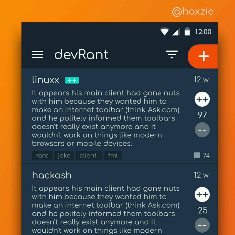
 Been looking around ways to improve devrant's user experience a little, Idk whether you guys like it or not.. ...

Forced choice between two options which both seemingly have irreversible and potentially destructive consequences. Tapping back or outside the modal doesn't dismiss it. No 'Read more' type link for the first option.
Laws and regulations against dark pattern design when?
edit: okay the readmore link is passable but I still want to be grumpy about it.
rant
gmail
ux
dark pattern