Ranter
Join devRant
Do all the things like
++ or -- rants, post your own rants, comment on others' rants and build your customized dev avatar
Sign Up
Pipeless API

From the creators of devRant, Pipeless lets you power real-time personalized recommendations and activity feeds using a simple API
Learn More
Comments
-
 Hazarth92354yGreat fucking design. I guess someone enjoys counting barely visible dots to find the right page
 -
Lexter11334y@Hazarth I asked designer. He gave me an answer: Number will be visible on hover statement.
I think he not just making flat designs, he also have flat brain already from it.
prev 6 7 ... 51 next
I mean, it is not rocket science... -
 Hazarth92354y@Lexter Yeah, it's not taking any less space on the webpage... look at that padding! you could easily fit numbers there...
just skip the border around the number and only use that for the selected one, it could look nice..
completely replacing the numbers with symbols and just showing on hover is kinda... idk.. over-designed... like too many different shapes in a logo or rounded edges on everything everywhere... -
Lexter11334y@Hazarth Most fun thing is in old website there are over hundred of blogposts so if i count correctly, it will take around 14 dots just for start.
-
@Lexter problem is a lot of users dont understand on-hover tool tips.
Proof of this takes five seconds to confirm. Go watch anyone 45+ use a pc and try to solve something that requires a tooltip.
Or go watch a 50 something play video games. Real time on-screen feedback gets hardly any visual attention. It can take minutes for them to figure something out.
Theres no attention to visual awareness or usability sometimes.
UX is about the only thing I know inside and out and I never even worked it for a living.
Related Rants

 My friend said an intern designed this UI for an internal site.
No. Just... no
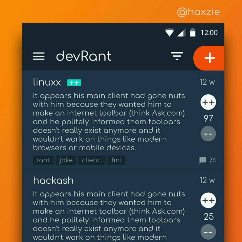
 Been looking around ways to improve devrant's user experience a little, Idk whether you guys like it or not.. ...
Even with something as simple as pagination, it's possible to create a complete accessibility abomination. Dear designer, you've perfected your flat design style.
Fuck you! I'm not coding this.
It's a website about selling solar panels, underfloor heating etc... Not a single piece of design reminds it.
rant
pagination
accessibility
flat
design