Ranter
Join devRant
Do all the things like
++ or -- rants, post your own rants, comment on others' rants and build your customized dev avatar
Sign Up
Pipeless API

From the creators of devRant, Pipeless lets you power real-time personalized recommendations and activity feeds using a simple API
Learn More
Comments
-
@ScriptCoded Yes 😁
Well, technically not a clone but just a client using the devRant public API.
For iPhone, iPad and macOS. -
Well, I can't count how many times I lacked the simple mention of *where* comment was posted.
-
@vintprox what do you mean where?
Like in what rant? But how would you refer to a rant? Showing the rant id is not useful. Maybe show the user avatar of the rant’s poster? But I’m not sure if that would be a good idea either. In addition to that, I don’t get that info from the API and would need to fetch it for each notification. -
@Lensflare Rant's short summary. If notifications wrapper had some sort of cache, yeah, that'd be great.
-
@vintprox oof, that would require a lot of space for each notification item. And would make it less readable. Too much info.
-
@johnmelodyme Not yet.
I will put it in Testflight when it reaches version 1.0.0, probably when I implement posting rants and comments. Maybe in a couple of weeks.
It‘s also open source:
https://github.com/WilhelmOks/...
Related Rants


 My friend said an intern designed this UI for an internal site.
No. Just... no
 Product dev: We need a new volume slider for ou...
Dev: Say no more!
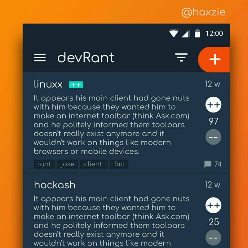
 Been looking around ways to improve devrant's user experience a little, Idk whether you guys like it or not.. ...
Notifications UI in SwiftUIRant.
I don’t want to just copy the UI of the official app.
So I’ve made a few changes:
Always displaying the name of the user and other stuff that makes it easier to scan visually, I hope.
Feedback is welcome.
devrant
ui
swiftuirant