Join devRant
Do all the things like
++ or -- rants, post your own rants, comment on others' rants and build your customized dev avatar
Sign Up
Pipeless API

From the creators of devRant, Pipeless lets you power real-time personalized recommendations and activity feeds using a simple API
Learn More
Related Rants

 My friend said an intern designed this UI for an internal site.
No. Just... no
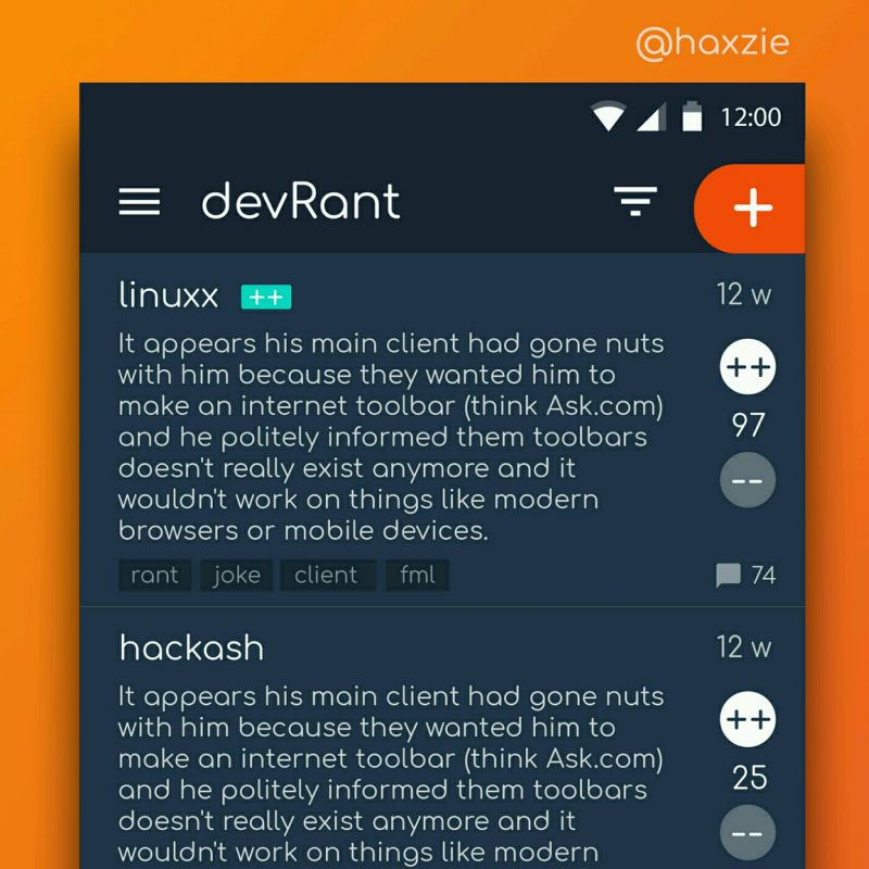
 Been looking around ways to improve devrant's user experience a little, Idk whether you guys like it or not.. ...
 When you're browsing web with firefox and accidentally opens new window instead of new tab
I really liked the idea with the new Firefox page, but the execution made me angry so I fixed it
- Removed the paddings and margins that took up space from information and actions
- Removed the four sentences that contained the same explanatory text I already understood in the initial popup
- Removed the fucking sidebar ad for Colorways
- I really like the Firefox logo so it can stay
Here's my userchrome repo if you want it, I reserve the right to discard the project and stop updating the repo at any point. It's best used as inspiration:
https://github.com/lbfalvy/...
rant
colorways
userchrome
firefox page
design
firefox