Ranter
Join devRant
Do all the things like
++ or -- rants, post your own rants, comment on others' rants and build your customized dev avatar
Sign Up
Pipeless API

From the creators of devRant, Pipeless lets you power real-time personalized recommendations and activity feeds using a simple API
Learn More
Comments
-
UI properties like this are indifferent to me but I enjoyed the rant very much.
-
@iiii I'm not sure what's flat UI, what's metro and what the new Windows 11 design is called, but I think Microsoft's designers peaked with the perfectly efficient and minimal yet not unpleasant Windows 10 style and now they're trying to minimize risks by adopting superficial aspects of Google's and Apple's design that don't transfer well to the highly utilitarian and dense views Microsoft excels at.
-
@iiii No, my bad, I used the double negative "not unpleasant" which is a bit confusing.
-
Oh yes, it is so damn straightforward - make a click area big enough to reach the border! I don't care for looks, just make it clickable on paddings, goddammit. *sigh*
-
@vintprox Exactly! I would personally prefer if the feedback - the visual button edges - would match the effective button shape and stretch to the edge, but there's no excuse for not extending at least the sensitive area to the edge.
-
They keep trying to market their os, but marketing keeps telling them "every now and then you have go change the product or people get bored with it."
Except they already have the market share and they should have moved on to working on their products and offerings instead.
Or doing what they do best:
Acquiring other companies.
Related Rants

 My friend said an intern designed this UI for an internal site.
No. Just... no
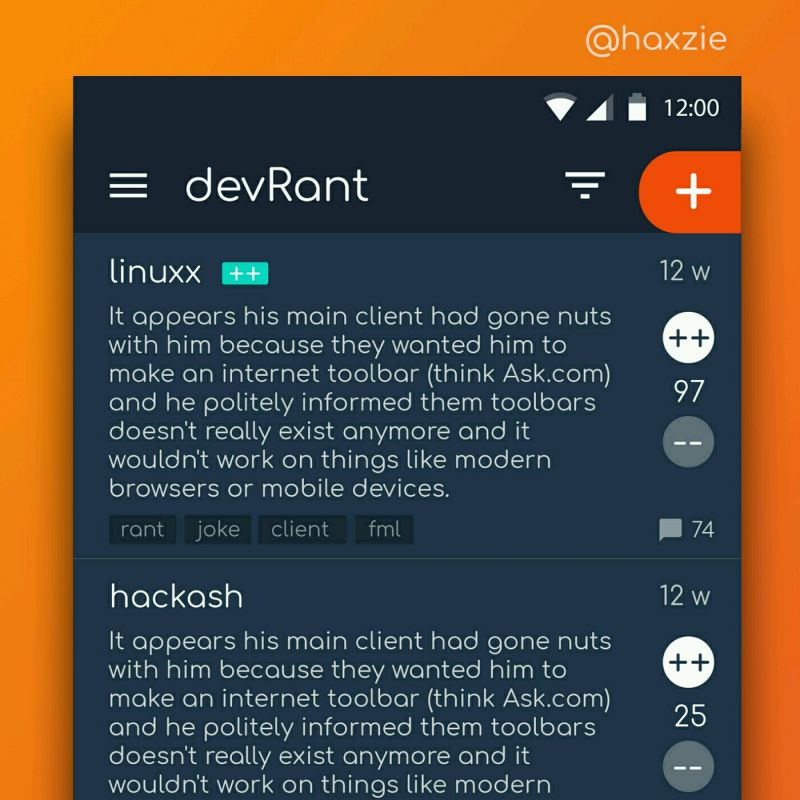
 Been looking around ways to improve devrant's user experience a little, Idk whether you guys like it or not.. ...
Windows 10 had one groundbreaking UI innovation, but no one adopted it and even Windows 11 discareded this revolutionary idea:
BUTTONS NEXT TO EACH OTHER AND AT THE EDGE OF A BOX DON"T NEED AN ADDITIONAL MARGIN
Windows 10 was the first and last OS where I never accidentally clicked right next to the X on a window, in a passive area that had no other purpose so it might as well have belonged to that motherfucking button.
I passionately hate this trend, adopted nowadays by every OS, that everything needs to be rounded, separated from the things around it, and "allowed to breathe". They don't breathe. They're not alive. They're fucking UI elements and the space between them is unused, lost space.
The only interaction a button has with its surroundings is that it pushes other content away to make room for itself and responds to the cursor. It doesn't wiggle, it doesn't grow and shrink, and it ESPECIALLY doesn't fucking breathe. Please, just let me click the motherfucking button.
Relatedly, do you know of a good, preferably bluish dark GTK theme that provides window decorations that stretch the full height of the titlebar and are laid out next to each other at the very end of the bar without gaps?
rant
usability
space
margin and border radius consume everything
screen real estate
design