Ranter
Join devRant
Do all the things like
++ or -- rants, post your own rants, comment on others' rants and build your customized dev avatar
Sign Up
Pipeless API

From the creators of devRant, Pipeless lets you power real-time personalized recommendations and activity feeds using a simple API
Learn More
Comments
-
 sariel78953y@jonas-w you click on something and an entire div pops out of the side from nowhere.
@theKarlisK it certainly makes me flip the fuck out every time I see one with 10+ tabs of data that is meaningless without all the other tabs data. -
 j0n4s50883y@sariel ah yes fuck them, especially these website that act like another OS, where you have multiple "windows" inside of it where you can drag them around and minimize etc
 -
 sariel78953y@jonas-w exactly!
@Oktokolo bad form across 20 different tools I use daily then.
It makes sense if you're checking boxes or flipping values. Hell, I'll even go as far as submitting any form.
Reading data from 10+ tabs of other related information that you need to flip between to get a "full picture" is just bad design. It's an amateur move that I don't think these well established companies should be allowed to get away with.
They took the whole "mobile first" mantra too far and now desktop UX is suffering for the 30% of manager minority because they are the only ones complaining.
Related Rants
-
 bjorngi24
 The aCalendar app let's you choose vibration pattern, it's one of the better settings I've seen.
 -
 aswinmohanme17
 When you take User Experience to the next level. Just what I was thinking
Credits : Riot App
 -
 htlr79
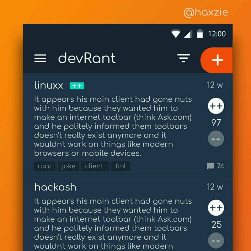
 Been looking around ways to improve devrant's user experience a little, Idk whether you guys like it or not.. ...

Why the fuck does every operations app do popouts now? I don't want a simple view of the data, I want all the data so I can compare it together.
It's not like you're saving any bandwidth! All the data is there, I can fucking see it 👀 in the dev tools!
I hate how every product now desperately tries to be like their competitor and everyone fails at it because everyone is copying everyone else.
rant
shitshow
uxfail
ux