Ranter
Join devRant
Do all the things like
++ or -- rants, post your own rants, comment on others' rants and build your customized dev avatar
Sign Up
Pipeless API

From the creators of devRant, Pipeless lets you power real-time personalized recommendations and activity feeds using a simple API
Learn More
Comments
-
lessi1373yHere on my laptop I can't even see the "4 years ago" or things like that, only "1 year ago" and everything else is dots
-
And there's so much empty space they could have used to show the full title, too. The two columns don't *need* a huge gap between them.
-
exerceo12123y@electrineer Perhaps it would not have survived without being bought off by a large corporation. It had funding issues prior to acquisition.
But indeed, as history shows, economic incentives are prioritized over users' interests. Google does not just discontinue many services, but also many features within their services.
Related Rants
-
 bjorngi24
 The aCalendar app let's you choose vibration pattern, it's one of the better settings I've seen.
 -
 aswinmohanme17
 When you take User Experience to the next level. Just what I was thinking
Credits : Riot App
 -
 htlr79
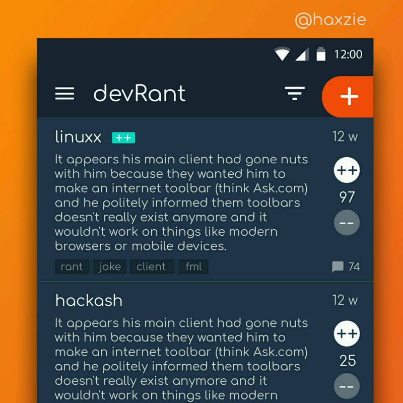
 Been looking around ways to improve devrant's user experience a little, Idk whether you guys like it or not.. ...

YouTube recently introduced a two-column view on their mobile website that is so narrow that only the first three words of video titles are readable.
Epic design fail.
https://imgur.com/a/PbyoMOX
rant
web design
ux
mobile web
redesign