Join devRant
Do all the things like
++ or -- rants, post your own rants, comment on others' rants and build your customized dev avatar
Sign Up
Pipeless API

From the creators of devRant, Pipeless lets you power real-time personalized recommendations and activity feeds using a simple API
Learn More
Related Rants

 My friend said an intern designed this UI for an internal site.
No. Just... no
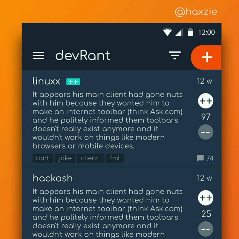
 Been looking around ways to improve devrant's user experience a little, Idk whether you guys like it or not.. ...
I fucking hate design agencies and everything related to fucking design!
Today we received an email from design agency asking us to put two images next to each other so that they can compare and see which one fucking fit better!
What is the difference between these two images:
first one has 28points of text size while the other one has 26 points ...
one more reason to hate this fucked up world!
undefined
agency
design
please leave this planet
no one likes you
what the fuck is wrong with this world
fuckwholes
please forget my email