Ranter
Join devRant
Do all the things like
++ or -- rants, post your own rants, comment on others' rants and build your customized dev avatar
Sign Up
Pipeless API

From the creators of devRant, Pipeless lets you power real-time personalized recommendations and activity feeds using a simple API
Learn More
Comments
-
 Grumm1899248dwhat kind of app or website is this ?
All I get is the version that still uses blue icons and the copilot one is only colored one. -
 devux-bookmark137248dMicrosoft favors "shit UX" at least since Windows 10, but they are not the only ones. Bad UX has become a mainstream trend.
 -
 BordedDev3131247dYeah, it's "the" logo of co-pilot right, it's not a tool it's a product so they have to have the same icon everywhere - some retard in a suit somewhere probably 🙄
 -
 Tounai1634247dI don’t understand why they want to spend so much money on AI features no one asked so bad.
 -
 Lensflare21882247d@Tounai because the competition is doing it and they don’t want to "fall behind"
Related Rants

 My friend said an intern designed this UI for an internal site.
No. Just... no
 Product dev: We need a new volume slider for ou...
Dev: Say no more!
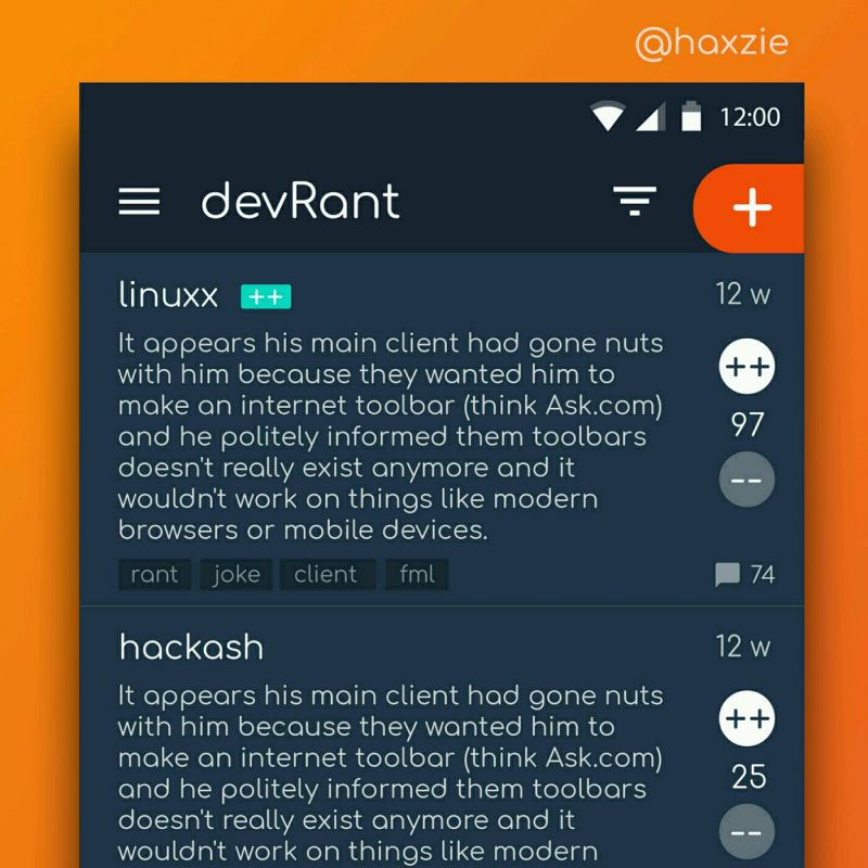
 Been looking around ways to improve devrant's user experience a little, Idk whether you guys like it or not.. ...
MS has added copilot to Outlook and placed the button in that left side bar where the other buttons are.
Thing is, that‘s the only colorful icon there.
Now every time I look at this bar, this icon always stands out. It looks like this is the selected icon, even if something else is selected.
For me this is a great example of shit UX.
They probably made it on purpose so that people are constantly reminded that COPILOT IS INTEGRATED IN OUTLOOK NOW.
They don’t care about good UX, they just want to smash it into your face.
rant
design
ms
ui
outlook
copilot