

Join devRant
Do all the things like
++ or -- rants, post your own rants, comment on others' rants and build your customized dev avatar
Sign Up
Pipeless API

From the creators of devRant, Pipeless lets you power real-time personalized recommendations and activity feeds using a simple API
Learn More


 When you're not creative enough to make a post that would give you some stickers but you have a 3D printer...
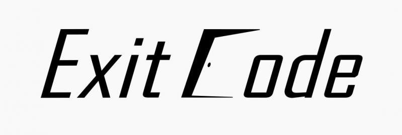 Logo (For my Hacking game) just finished. Thoughts?
 The Ascii art of devRant logo, time for new ssh banner for server
Who likes BT (British Telecom) new logo?
Me 👍
random
british telecoms
bt
logo
new logo