Ranter
Join devRant
Do all the things like
++ or -- rants, post your own rants, comment on others' rants and build your customized dev avatar
Sign Up
Pipeless API

From the creators of devRant, Pipeless lets you power real-time personalized recommendations and activity feeds using a simple API
Learn More
Comments
-
 C0D4644186yI build functionality first, then strap the UI on top or in parallel depending on what's being worked on.
 -
 C0D4644186y@Karthik22 I've found it easier to have the backend built up to work and then build the frontend towards the end as the stakeholders will want to be able to see that magic button that's going to save them time actually do something when it's pressed, they seem to be more impressed that way 😉
 -
Form follows function, that breeds usable stuff. So first think what exactly the user will be doing with your website, what his intended workflows will be. The architectural design needs to implement them, after all. If the WHAT is not clear, thinking about HOW won't make sense.
-
 C0D4644186y@Fast-Nop true but that's what detailed analysis are for, or mockups from requirements gathering.
You need to know what before how, but you need to build the inner workings for a form can actually be used.
That's why I mentioned in parallel, as you can have a shitty form on the page that's "usable" and then comeback later and throw the design concepts on top to make it "pretty" later. -
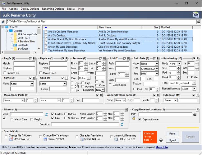
@C0D4 It's not about making it "pretty", this is not what design is about - because things can be pretty and still unsuited for the task, although users tend to be more forgiving if the unusable stuff looks good.
My poster child for such a UI is below. No matter how pretty you make that, it's beyond repair because the whole design is feature-centric, not task-oriented.
-
 C0D4644186y@Fast-Nop not going to argue with that. But I will raise you my poster child for such feature over task design 😎
Hopefully @Karthik22 can have the foresight to plan ahead and have the business agree on what they want and how it's going to be presented before he starts building a thousand buttons onto a UI.
I feel we have had this battle of designs before 🤔
-
@C0D4 Yeah that's the typical result of "design by compromise". Two stakeholders can't agree which way to implement, so they end up offering both. Rinse and repeat, and you get such abominations. Also typical for OSS team collaboration with the usual bad OSS UIs.
Remember these "portal" websites that never could decide what they wanted to be? Remember the totally overloaded Lycos search? And then Google came, it wanted to be a search engine. BAMM.
The hard part e.g. in a large store is how to organise stuff, i.e. the information architecture (not the SW architecture). On the one hand, the user must reach everything essential, but on the other hand, each option has mental user cost. The hard question is "what is important?", and if everything is important, nothing matters.

Hey guys,
I need a suggestion
I work for a website project
I Still have a confusion about that.
Which one mainly focus on first when I start from the beginning
Either focus on design or focus on functionality
rant