Ranter
Join devRant
Do all the things like
++ or -- rants, post your own rants, comment on others' rants and build your customized dev avatar
Sign Up
Pipeless API

From the creators of devRant, Pipeless lets you power real-time personalized recommendations and activity feeds using a simple API
Learn More
Comments
-
I think there are contrast problems, but without a project link, that's hard to tell.
Apart from that, I'm sure that there's a whole truckload of HTML misusage underneath because it would be the first site presented here without these problems.
Plus I somewhat suspect there's CSS shit like Bootstrap, Bulma or Tailwind involved, simply because that abomination is also widespread. -
Hi @Fast-Nop ,
I will check the contrast issue you tell me.
About the HTML, maybe. Am making some refactoring and dive-for-clean time to time.
Regarding the bootstrap or other CSS framework, am not using anyone. The only thing am using is Stylus but it's just a CSS processor.
Many thanks for your words ^^ -
@kristofersoler You can check the contrast using https://wave.webaim.org/ - which also hints at botched up heading levels, missing page landmarks and missing alt texts. Validating the HTML with https://validator.w3.org/ should be easy enough.
-
@kristofersoler If you get hardcore, you could also install NVDA (for free), see https://en.wikipedia.org/wiki/... , just because it's a very interesting experience how a fully blind person will perceive one's website.
For me, that was an enlighting moment where I really understood the difference between semantic HTML and random misuse of tags.
Related Rants

 That moment when GitLab adds an article you wrote to their blog
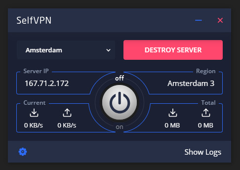
 I started a nee personal project few weeks ago. I named it SelfVPN. Its simply a VPN client that lets you crea...
Things are getting better. Little by little with no stop.
Among other things we have a list of posts based on a tag.
Am pretty happy about the style is getting.
Any suggestion is welcomed.
random
personal project
showcase
blog