Ranter
Join devRant
Do all the things like
++ or -- rants, post your own rants, comment on others' rants and build your customized dev avatar
Sign Up
Pipeless API

From the creators of devRant, Pipeless lets you power real-time personalized recommendations and activity feeds using a simple API
Learn More
Comments
-
 kiki374865y@nitwhiz to make large responsive headlines that wouldn’t make a column of one letter per row on smaller screens
 -
 Creep16365yI might actually try that out later. My personal website has a quite big font on a desktop and still a really really tiny font on a phone. I used em and viewport might be an option.
 -
 theuser46585yYou can also define both max and min font size using clamp.
clamp(20px, 2.5vw, 30px);
or if you need to support old browsers:
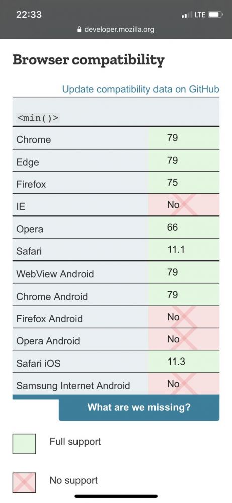
font-size: min(max(20px, 2.5vw), 30px); -
 theuser46585y@uyouthe True about support. Our solution was to simply provide fallback static values, but your method gives us a minimum, so I will steal that.
The Samsung browser is sadly still kinda relevant enough (IE support dropped althogether). Still, good to see that safari is supporting clamp cause I believe that kinda just recently happened. -
 deliwa3135ySo the text would be unreadably large on ultra wide screens? Using the clamp function seems much better for that case
 -
@uyouthe Punish users of IE. Drop support. We can take back control of the browser wars....
Related Rants


 How to vertically center in css..
 Yeah no
CSS quick maffs:
Using viewport units to define font size but sometimes it's too small?
Instead of font-size: 10vw;
use font-size: calc(10vw + 20px);
This will make sure that font size is AT LEAST 20 px no matter the viewport width. Treat the resulting font size like a function of viewport width and feel free to experiment with it. With calc in that case you can achieve the best typeface responsiveness possible.
random
css