
Ranter
Join devRant
Do all the things like
++ or -- rants, post your own rants, comment on others' rants and build your customized dev avatar
Sign Up
Pipeless API

From the creators of devRant, Pipeless lets you power real-time personalized recommendations and activity feeds using a simple API
Learn More
Comments
-
 wicho25189y@Dacexi Youre gonna have that same problem everywhere with a white circle... Basically you have a R with a circle ended shadow...
 -
 Dacexi119169y@h3ll Also. Gradiants are NOT good in logos. it makes it feel like it was made in 1984
 -
You know there is flat design and then there is flat design, get it? @h3ll is right about the keyhole thing and off centre well so is the nature of the r. I personally would loose the icon look, long shadow also looks best to me when used with something bit more isomorphic. But as is i would only lose the shadow, split the r's vertical from body if intend to keep in circle. But in general i like my logos to say a little something about what they represent. I LIKE THE BLUE THOUGH.
-
@Dacexi gradients used to add depth or enhance coloring works well. Think of a gradient as light direction
-
I would personally shift the R to the right as to make the type shape more evenly distributed around the circle. I imagine you have aligned the letter bounding box to the center of the circle, and this is generally ok but you are using a font that has more weight to the left for the R in particular. Maybe it is just my OCD speaking but I think it would look better.
To be honest I don't like this font - I believe it was used widely in the past, so it conveys a vintage message that contradicts the modern background (heavily inspired by Google material design).
If you are happy with it, it is OK! But I suggest you think more carefully about what aspects of your brand (or yourself) you want people to grasp by looking your logo, and design around it. Good luck!! -
Either way this style is often used when you want to give a retro feeling to the logo (and the brand itself). For instance take the logo of this recent australian rock band. Their main inspiration are classic rock groups such as Black Sabbath and Led Zeppelin, that is why I think they went with a logo like that to show public that they sound classic, which indeed they do.

-
Offset the R drastically instead of trying to center it. Maybe intersect the circle with the R and trim off the excess. Try other fonts with the R. Don't church it up with gradients and all that junk until it looks good as a single color logo. A good logo enforces the brand with striking geometry first then color. Think of brands you already use. Nike has a swoosh and it gives zero fucks what color it is but its recognized everywhere. The same goes for the Apple logo which used to be a rainbow but easily worked without. The Nintendo logo is most of the time in red, but doesn't need color to be distinct. Commodore's C= logo is a distinct shape first, followed by color. The Atari logo is agnostic of color as well. If you nail it in black and white color just adds flavor. Gradients are okay if used sparingly. Basically, if you can't stamp your logo with a rubber stamp and an InkPad with one stamp, you're doing it wrong. DevRant adheres to this rule too when reduced to a single color.
-
This looks like a copy of the R logo. Check out cran. https://cran.r-project.org/


Related Rants
-
 devmonster84
 My friend said an intern designed this UI for an internal site.
No. Just... no
My friend said an intern designed this UI for an internal site.
No. Just... no -
 FTcuber30
 When you're not creative enough to make a post that would give you some stickers but you have a 3D printer...
 -
 htlr79
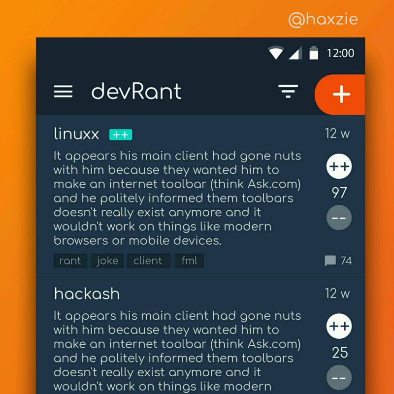 Been looking around ways to improve devrant's user experience a little, Idk whether you guys like it or not.. ...
Any input on my new logo design?
undefined
logo
design
feedback