Ranter
Join devRant
Do all the things like
++ or -- rants, post your own rants, comment on others' rants and build your customized dev avatar
Sign Up
Pipeless API

From the creators of devRant, Pipeless lets you power real-time personalized recommendations and activity feeds using a simple API
Learn More
Comments
-
 C0D4644188yI think I see 5 fonts being used here?
Try and limit yourself to 3 at the most, fonts can get very distracting when a lot are used.
Otherwise for a simple minimal page it looks alright, probably give yourself some more space between the title, nav and content though. -
 Jonas-438yIf you have to shorten the text, add some kind of 'call-to-action' to the end.
Also add some kind of visible spacer between each post. Some kind of horizontal lines or something. -
 yugi9458yA line like you put before the bottom line after each post for increasing the readability
 -
I dislike the headers capitalization, Wget, Curl, Best, makes it look like cheap marketing.
-
Put a 1px border below the nav links, or a CSS box shadow, just to separate the header from the content.
-
@C0D4 Thanks for the suggestions! There are only three fonts, but I'm using different weights. Would you advise against that?
Related Rants

 My friend said an intern designed this UI for an internal site.
No. Just... no
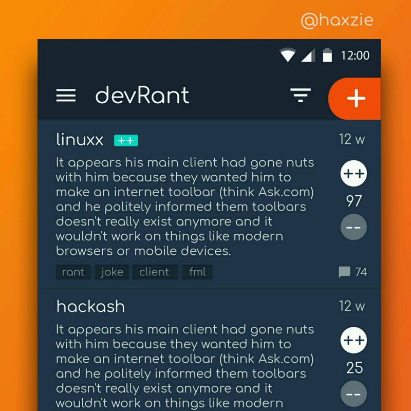
 Been looking around ways to improve devrant's user experience a little, Idk whether you guys like it or not.. ...
So I' working on a personal blog/site, but I'm a terrible designer. Any suggestions and/or opinions would be greatly appreciated!
undefined
design