Ranter
Join devRant
Do all the things like
++ or -- rants, post your own rants, comment on others' rants and build your customized dev avatar
Sign Up
Pipeless API

From the creators of devRant, Pipeless lets you power real-time personalized recommendations and activity feeds using a simple API
Learn More
Comments
-
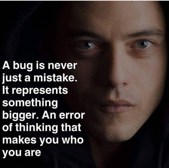
Mr Robot is legit the best series out there that involves computer science and criminality around it on all levels. It got me breathless a lot and made me think a lot more conscious about security in general. Also very distopian. Love it.
-
@kobenz it's not. After years of fucking around with my shell I decided that the Windows 10 tray is the most productive and space efficient, so I recreated it in KDE.
-
@electrineer I have a permacold, my nose has been running for 3 years with brief intermissions
-
@electrineer i wondered if people will point out the tissues or the 4 passports first.
-
@tosensei Why, because I don't want to take two clicks at different points on the screen to get to the list of Bluetooth devices? Or because I don't want to hover at an edge waiting for the app list to show up? Or because I don't want two separate bars to consume the 14" screen? No, those things fit on one bar and should be permanently on screen, and this bar should be at an edge different from the open program's menubar so that both button clusters only stretch in one dimension and therefore misclicks are minimized.
The launcher, clock and keyboard layout are in a familiar location to Windows people because it's a minor compromise given the above and allows laypeople to use my laptop. -
@tosensei I'm actually quite proud of outgrowing the need to be different for the sake of being different. The Windows layout works really well, the main alternative is a keyboard-centric shell but I don't have the sustained patience to figure out how to reconcile each new program's shortcuts with a massive systemwide shortcut set so I avoid that.
-
The only reason for me to reconsider my layout would be a global application menu in KDE and widespread support for it in the programs I use. The latter is still missing.
-
@kobenz I had i3 with polybar, but the Unicode widgets were unwieldy and ugly. I tried Hyprland with Eww in January and it was pretty cool, but I didn't really have the time to configure it properly so I can't really form an opinion other than that the CSS config is amazing.
-
@kobenz It looks like it's Xorg-based, I'd rather not adopt X-only stuff anymore. Also, it gives the impression of an underdesigned tool, like most terminal GUI programs. It actually takes a lot of careful planning and code to build a good minimalistic tool. Eww is a great example IMO.
Is this impression wrong?
Related Rants

 🐛🐞👾
🐛🐞👾
I love the authenticity of this show
rant
mr. robot