Ranter
Join devRant
Do all the things like
++ or -- rants, post your own rants, comment on others' rants and build your customized dev avatar
Sign Up
Pipeless API

From the creators of devRant, Pipeless lets you power real-time personalized recommendations and activity feeds using a simple API
Learn More
Comments
-
Design isn't my forte, so I'll keep my mouth shut.
But... What should this logo be?
Looks like a combination of onion and turd with numbers in it...
Looks to me like New Oil is largely a TOC for all kinds of content related to data security.... Even a simple book or sth like that would be better imho than the typical binary number shit.
It just rubs me off ...
Or sth funny like "How to keep your nibbles safe"... As most guys don't know what half bytes are. -
@IntrusionCM
Let me summarize:
- this graphical piece on left is easily confused with the logo;
- binary streams are an artifact of oversimplification that you don't like;
- you would rather prefer a book instead of numbers.
Is this right? -
@vintprox you spoil the fun. :(
To two and three:
Yes, but my ideas were shot from the hip. Two things that come up in most clickbaity things: Image with "code" in background - where "code" is at it's worst HTML, or some "number stream"... Both having nothing to do with what the site actually represents.
From a more unfunny point of view, as in business talk: Choose a logo that can be remembered. Building a brand that is remembered is one of the most important things. If one cannot remember the front page or the associated Google search tags... They probably will not come back, as their brain knows just that there was a site of good content. ... But brain has no credible information that was saved along with that association. -
@IntrusionCM I remember stressing in the past about how it's crucial to put your glorious epic super-dooper shiny logo on landing, and was actually considering that for TNO a good minute.
I couldn't come up with anything more witty than to split this drop in half and show a metaphore to how easy it is to read a person by their digital data sometimes. I'm looking forward for ideas to make it less clever and more memorable! -
I should reiterate in case someone doesn't look into comments of prototype: this image on the left is a temporary placeholder awaiting replacement with something that can be processed more faster.
Anyway, what are your thoughts on typography? Do sizes strike a balance, or there is something that requires attention? -
Not a designer, but one as to do wireframing and hifi mockups, for personal projects mostly.
Penpot ftw !
They've been adding a whole bunch of features lately. Wish I could strip down most of it to keep it lean and functional.
Now, besides the placeholder (kinda big and confusing ngl) your mockup does look nice. Maybe use a slightly darker hue on your primary button to contrast a bit more the text in it. -
I like it, I just can't shake the feeling that the graphic on the left is somehow off...
Maybe it's the 5-bits per line that bother me, unsure. The general shape is a tad strange maybe... -
@Ranchonyx
I've used a width difference between 0s and 1s to pack them inside a head silhouette. Eyes and mouth placement were pretty much a happy coincidence. I guess, the nose is really weird, as well as the absence of filler above and below. -
@vintprox Oh that's supposed to be a head! Interesting idea, but I wouldn't have guessed that in ten years xD
-
"Get Started" could improve readability. The white text is a little harder to spot there.
-
 kiki374862yYou forgot the appropriate font fallbacks! In iOS lockdown mode where custom fonts don’t load, or in any other case they didn’t load, users will see times new roman. But you’re clearly using a sans serif typeface. It means you should do a fallback, like this:
font-family: “(your custom font)”, sans-serif;
If your font doesn’t load, it will fall back to a generic sans serif typeface, preserving your design intention.
-
 kiki374862y
 -
@kiki
Uhm, it's not an HTML implementation, but OK. I've been knew of these font issues long ago! :) -
@kiki
It's a prototype like one you'd have in Figma. I think Penpot has miles to go, like you say, with setting fallback font - it simply has no such option, whether I want it or not. I'll attach a screenshot for you to see the thing.
Website implementation, of course, will be more rich and not spare any semantics.
Related Rants

 My friend said an intern designed this UI for an internal site.
No. Just... no
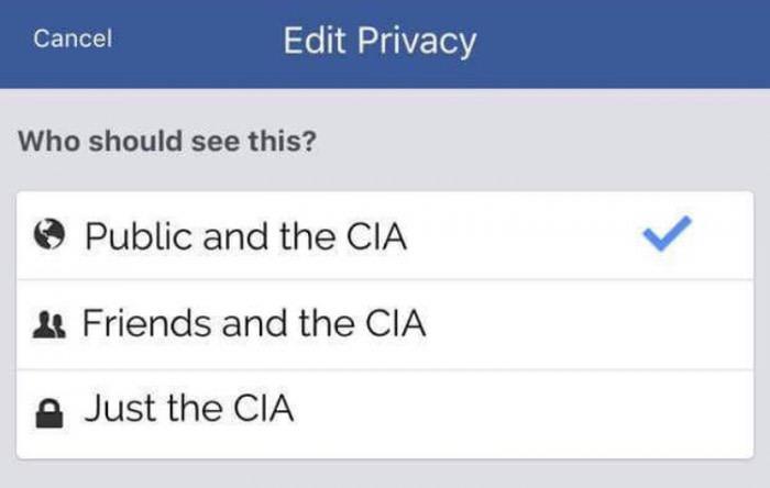
 Privacy is a legend
I'm working on a prototype for The New Oil revamped landing page and wanted to know your opinion so far.
Issue for context: https://gitlab.com/thenewoil/...
How do you perceive "clear screens" design paradigm? What could use more improvement?
question
nate
prototyping
cybersecurity
thenewoil
website
surveillance report
techlore
tno
design
privacy