
Join devRant
Do all the things like
++ or -- rants, post your own rants, comment on others' rants and build your customized dev avatar
Sign Up
Pipeless API

From the creators of devRant, Pipeless lets you power real-time personalized recommendations and activity feeds using a simple API
Learn More
-
Anyone else feel like the rebranding was completely forced?
The typeface was so much better before. Google, I know you've invested heavily in sans-serif-ing the world for some reason but come on. Give it a rest.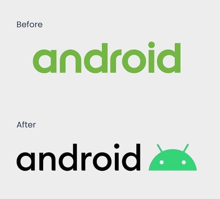 9
9 -
CSS quick maffs:
Using viewport units to define font size but sometimes it's too small?
Instead of font-size: 10vw;
use font-size: calc(10vw + 20px);
This will make sure that font size is AT LEAST 20 px no matter the viewport width. Treat the resulting font size like a function of viewport width and feel free to experiment with it. With calc in that case you can achieve the best typeface responsiveness possible.13 -
Has anyone here paid for a font? I'm thinking about dropping $200.00 for the Operator Mono font, I use Fira Code but that cursive typeface is SOOO FANCY.
 7
7 -
The only really influential product Microsoft ever created is Verdana. Yes, the typeface.
It was the first typeface designed to be displayed on a screen rather than in print. Before that, there only were monospaced typefaces like we saw in terminal, or digitized typefaces like Helvetica Neue.
More than that, its looks were partly generated by an algorithm, hence the odd, alien looks. But because of it, Verdana works amazingly good in small labels. The 8pt Verdana is more readable than 10pt Helvetica.
I still use Verdana in all of my projects, religiously.
All the other Microsoft products: Windows, Xbox, Surface, Office, Azure, all that stuff — is mere garbage compared to the influence Verdana made on how our interfaces look now.4 -
I'm not lazy. If you want me to build you a typeface - I'll learn how to do it... and I'll do it ~ but when I get files like this... my brain just goes blank. I don't even know how to rename these. Even if I automate it... I don't know what any of them are. : /
 3
3 -
(!rant && question)
For the front-end devs out there, do you guys prefer using font-weight to change the weight of the font or do you guys prefer using separate names (Font Name Black, Font Name Bold, and so on)2 -
The main difference between macOS and windows/linux is that it has Helvetica, the best typeface to ever exist, built in. When an email arrives, you know it's your fellow Mac user who sent it, so you know they at least take a shower every day, and you don't have to explain things like they're five.
You can use Helvetica for everything. Designers love it. Guess what — all of them have Macs, so things they design look best on your Mac as well. They don't test on windows or any linux.
Linux has the important mission of overthrowing windows as the main desktop OS for normies, and that's a good thing. Valve and Steam OS is a massive step forward. But, if you value your time and want to be surrounded with beautiful things, nothing beats macOS.21


Top Tags
Weekly Rant
View